How To Do This

Anatomy of a Conceptual Image

To my mind, there are two kinds of composite images.

The first is the kind that’s shot all at once in a single location. You’re getting different pieces of the image across multiple photos, but the lighting isn’t changing and your camera is stationary. You choose which photos you want to comprise your final image, and in Photoshop you layer them and mask in all the individual elements. This is pretty straightforward.
The second kind of composite image is the one that’s shot in different locations at different times. At least one location is a “real” place, the other is often the studio. This type of composite image is more fun because it’s harder from both a conceptual and technical standpoint, and planning the pieces and how they’ll fit together is very much like a puzzle. Lighting, camera position, and focal length all need to match, and this often takes some imagination at one stage of the shoot or another.

The image below is the second sort of composite, and below I’ll talk about the shoot and the edit, as well as my practical and creative considerations along the way.

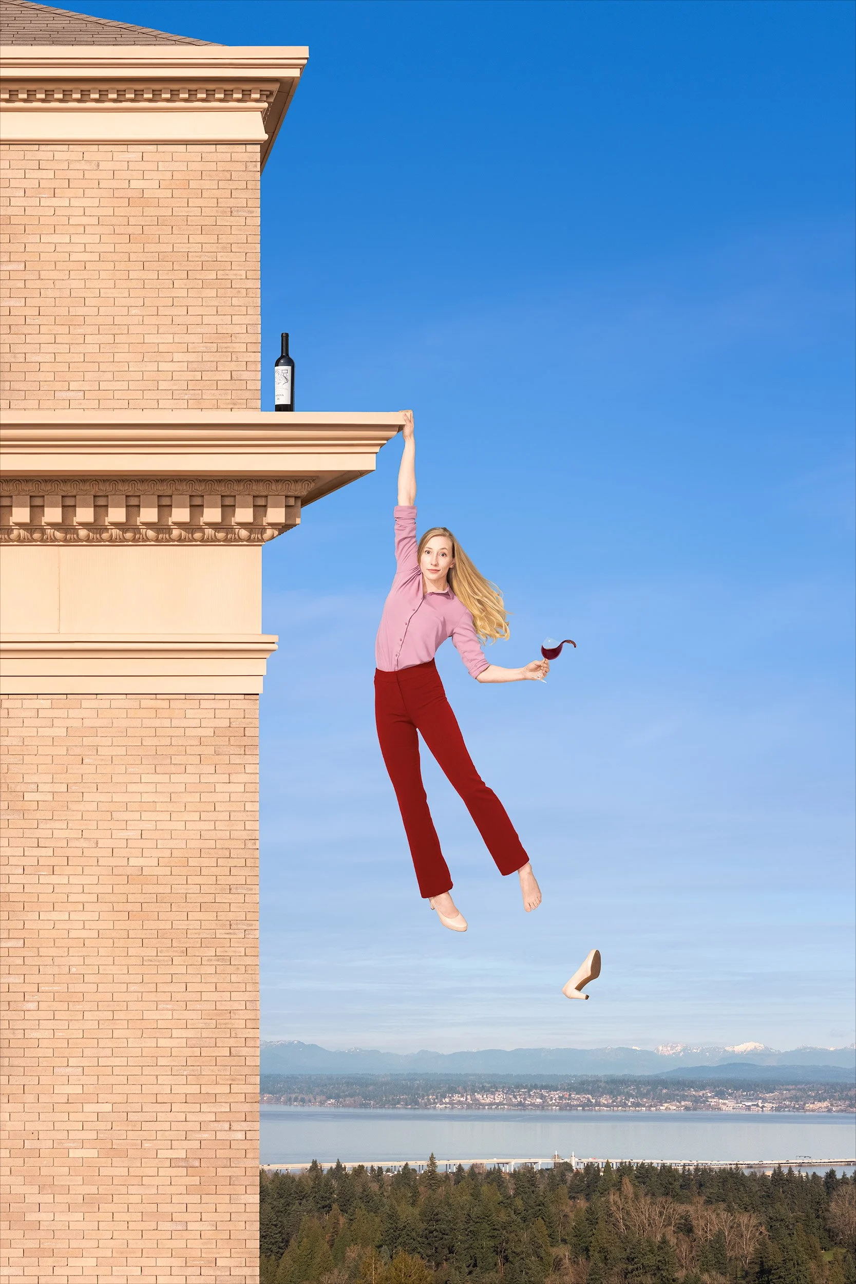
The image is made up of twenty-two individual pictures. More than you’d expect, right? You’re welcome to try to guess them, but here they are:

1. The building, an HDR panorama of nine drone images.
2. The background, a drone panorama of three images.
3. The bottle.
4. The shoe.
5. Sarah’s body (Sarah’s my model, but you figured that out yourself).
6. Sarah’s face.
7. Sarah’s right foot.
8. Sarah’s left foot.
9. Sarah’s beautifully flowing hair, a blend of two images.
10. Sarah’s left arm (starting at the elbow), holding the glass atilt.
11. The wine splash.

Goodness, you might say, the Sarah in the final photo is made up of eight exposures? That seems like a lot. Couldn’t you have gotten her all in one shot, with the body position and hair and wine splash and facial expression and everything? Theoretically, I suppose. But in practice, of course not—getting everything you want in a single image is kinda like setting those monkeys down at their typewriters to try and come up with Shakespeare. No, I’m not comparing this photo to The Merchant of Venice. I’m just saying you’d be at it a long, long, long time, and you’re far better off just building a Frankensarah.

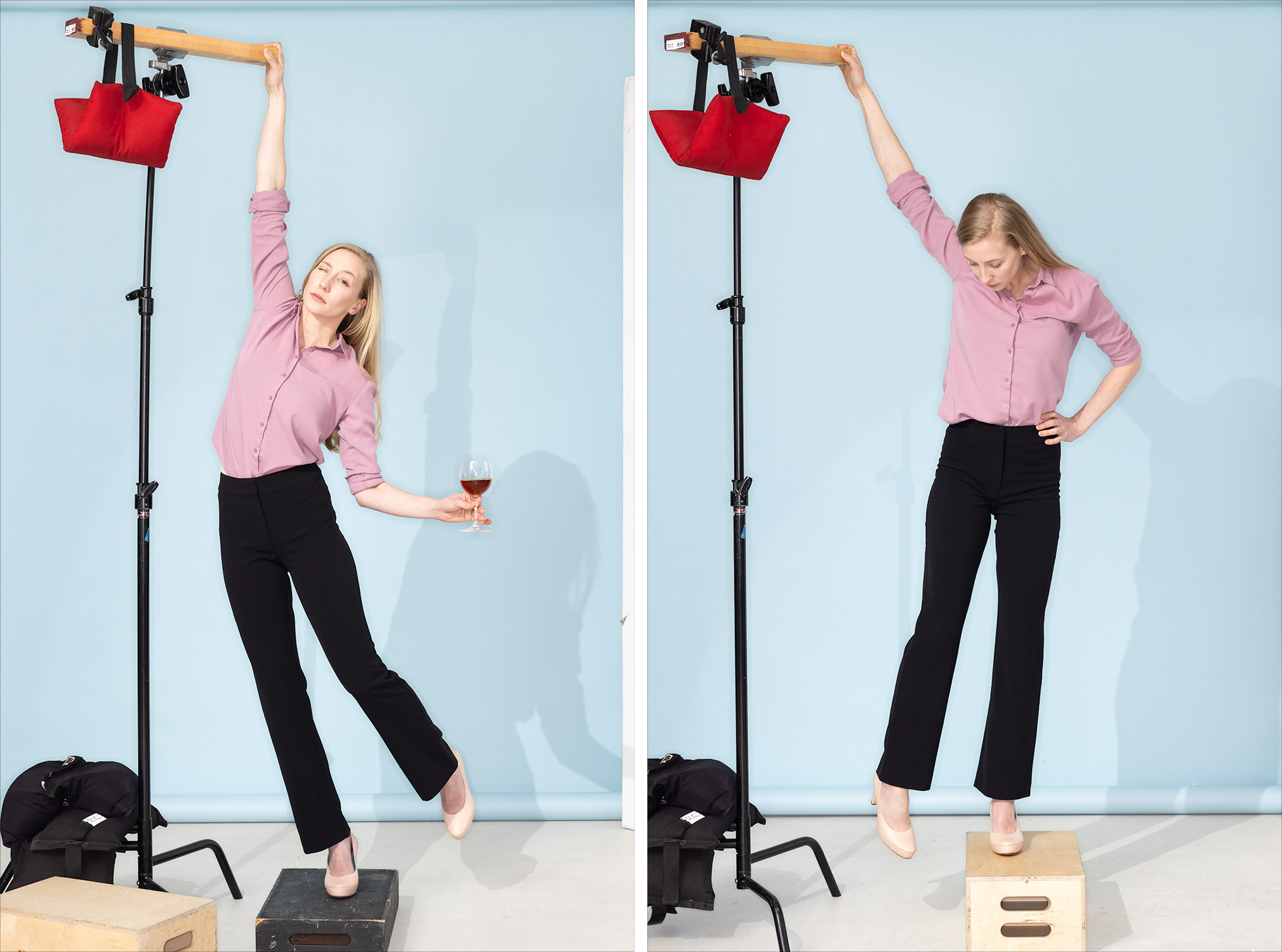
This was the studio setup. On the left, how I positioned Sarah for the shoot (although this wasn’t a frame I used) and on the right, the capture I used for her right foot. You can see why the foot composite was necessary. You can’t photograph her actually hanging by one arm for all kinds of practical reasons, and there’s no way for her to stand in heels that’ll make her foot look as though she’s not standing on something. So, we got her body positioned well and shot her feet and the empty shoe separately.

For Sarah’s flowing mane, I shot about a half dozen pictures of her whipping her hair off to the side. I used two of them to make her hair in the final picture.

You’ve probably already noticed that the pants were black to start with. Sarah didn’t have red pants in her wardrobe (well, she did but they were wrong for it), but I liked the shape of these so we went with them. I changed the color in Photoshop to complement the rest of the image. Black would’ve been too heavy.

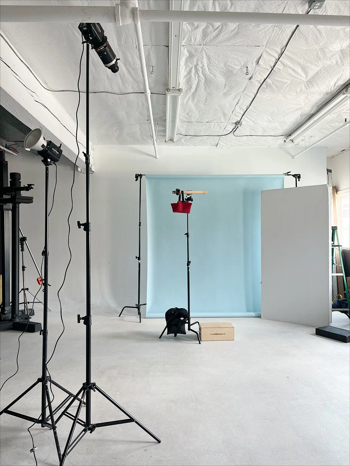
And here’s the studio lighting setup. It’s pretty simple, just three lights.
The one at the far left is bouncing light for a soft but directional fill.
Next to it, on the taller stand, is the main light. It’s a very directional light to mimic the sun in the photo of the building. The long, cylindrical attachment mounted on the front of this light is called an optical snoot. Inside it are lenses that focus the light from the strobe, lining it all up and aiming it in the same direction much like an overhead projector does. The result is a very hard light and sharp-edged shadows, like sunlight on a clear day. It’s a look you can’t otherwise get with a strobe.
The third light, not pictured, was a ring light on my camera for a smidge of front fill.
And at Sarah’s eight o’clock was a large piece of white foam core to bounce a little light in from the back.

In this post I’m coming to the background last, but when making composite images, you finalize the environment first. The background is the foundation of the picture—its tomato base, if you will. You put the subject into the background; you don’t put the background behind the subject. I find it’s good to shoot backgrounds on a tripod so that I can step into frame as a stand-in for my model(s). It helps to make composition decisions, but it also provides a useful reference for how to approach lighting a model in the studio. I couldn’t get into this photo, of course, so I had to think a little harder about the space Sarah would occupy and the proper placement for the drone.

I also had to think about how I wanted Sarah to be lit, because when you’re shooting backgrounds, you have to think about how the light in the scene will work for your subject. I chose late afternoon for the building shot because I wanted the sun coming from camera left at about forty-five degrees. I knew that would look nice on Sarah, if there was also plenty of fill on her. There wasn’t any fill light on the building, of course—the shadows were pretty deep—so I had to shoot it in such a way that I could make it look like there was light filling in those shadows.
That’s partly why there are so many pictures that make up the photo of the building. As I mentioned before, the building is nine photos stitched together. That’s three pictures, top to bottom, and a bracket of three shots for each picture. With that exposure bracket, I could lift those dark shadows as much as I needed to make the lighting of the building and the lighting on Sarah match.
So why not just shoot the building in a single bracketed picture? Why nine pictures, instead of just three? That certainly would’ve been easier, but my done only shoots horizontals. That means I’d’ve had to crop the center out of a horizontal image to get the vertical shot I wanted, and I’d’ve wasted half the frame and ended up with a comparatively lo-res shot of the building. Instead, I shot the bracket of three for the center of the image, tilted the camera up for another bracket, and then down for a third bracket. Stitch those together and you get a beautifully (and unnecessarily) hi-res photo with vast dynamic range.

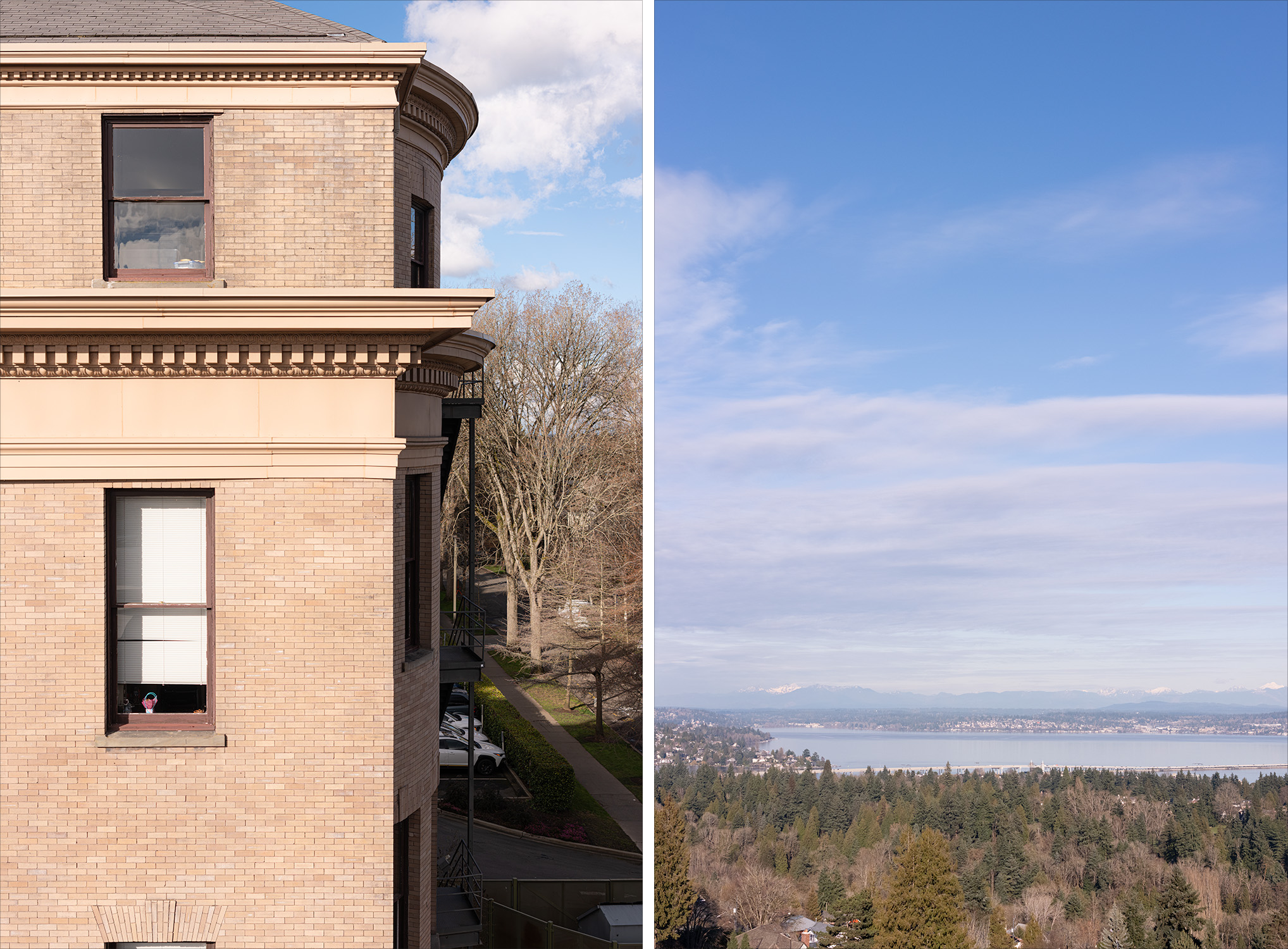
The building I chose for the picture was Holy Names Academy in Seattle’s Capitol Hill neighborhood. I wanted something that looked more classic than modern, with brick that was light in tone and warm in color, and I needed a fairly deep ledge for my model to hang from so she wouldn’t be too close to the building. Holy Names was perfect.
I did a fair amount of cleanup to the building, mostly straightening and leveling its many lines. I didn’t love the tired look of the brick in the building’s upper section as compared to the lower section, so I copied the lower brick and replaced it.
The sky, water, and trees was the view from a little higher and to the east of Holy Names. This was again a stitch of three photos to get a vertical image, but I didn’t bracket them. I made some contrast and color tweaks, muted the clouds a bit so Sarah would stand out, and removed the houses hiding in the trees. Otherwise, a pretty straight photo.

And…I think that’s it. There it is, a conceptual composite photo.
And look, Ma—no AI!

BMW Northwest Life cover shoot

I love editorial photography. The work is creative, the subjects are interesting, and the conditions are unpredictable. You just never know how it’s going to go, so you have to be ready to let go of preconceived notions and roll with the punches. Those punches can come in many forms. Sometimes the punch is that the subject can only give you ten minutes instead of the hour you thought you had. Sometimes it’s a sudden rain shower, or a broken strobe, or a bored security guard. Whatever it is, you have to take it in stride, figure it out, and move forward.

In this case, the punch was a car. The cover of the magazine was to be an environmental portrait of Manfred Scharmach, owner of BMW Northwest, with his gorgeous 1939 BMW 327/28. Full disclosure, I don’t know anything about cars. I can fill the gas tank and change a tire, and I know you don’t want frozen wiper fluid lines on a cross country road trip in the dead of winter, but that’s about it. I do appreciate a beautiful design when I see it though, and this car shook the Dick Tracy loving child in me wide awake.

In our conversations about the cover image, Lori Randall (Randall PR) had in mind a rural setting—trees, sky, maybe even some water somehow. We’d picked several spots near the dealership to scout ahead of time and I checked them out on Google’s street view. On the morning of the shoot, Lori and I and Uly, my assistant, visited a couple locations and picked our favorite: a grassy lot with trees in the background, very Pacific Northwest. By the time we’d be shooting, the sun would be in just the right spot for a late morning rim light. Plans!

So back to the punch: the car wouldn’t start, and there was no way to get it from the storage garage to the location we’d chosen. While Manfred kicked himself for not trying the car the week before, we looked for another option. Lori adjusted to the situation brilliantly, and we all quickly agreed that the wall of the garage was perfect. It didn’t say rural, of course, but its two-tone paint scheme echoed the car’s and once the BMW was pushed halfway along the building to the right spot, the background was beautifully broken up by the shadow of a tree. I knew the sun on Manfred would be a problem and we were ready to break out the scrim to deal with it, but once the strobe with the octabank was in place, it acted as a flag and did the job for us.

We shot away and Manfred did a wonderful job of letting go of his frustration. In the end, Lori and I were both super happy, especially given the circumstances. The results were objectively great and the shot even looks intentional. It wasn’t what any of us had envisioned, but sometimes that’s how it goes. Curveballs! Isn’t photography fun?

BMW Northwest Life magazine with location portrait of Manfred Scharmach on the cover.

Who Wore It Better?

If you’ve ever met me or read any of my blog entries, you probably know that I believe photography is one of the best jobs in the world, and that I consider myself seriously lucky to be doing it professionally. Sometimes a portrait subject will ask what I’d do for work if I didn’t make pictures, and I honestly don’t know what to say. I can’t imagine breaking up with photography, or cheating on it with some floozy of a tech job. That said, however, it’s also true that like any relationship, the light can go out if you don’t occasionally stoke the fire. I don’t know any photographers, regardless of how much they love creating images, who don’t need to recharge their creative batteries from time to time with a personal project. So, it was in that keep-the-fires-lit spirit that I undertook the surprisingly entertaining extracurricular project of ruining classic paintings by inserting my face into them.  The process is pretty simple, but requires lots of attention to detail:

1.  Settle on a painting you'd like to debase. If you’re like me, the problem won’t be finding a painting you like; it’ll be narrowing it down.
2.  Photograph yourself. Obviously, it's crucial that the position of your head match the position of the portrait subject's head.  If you're off by much at all, you'll have problems when you get into Photoshop.  It's also necessary to match the lighting in the painting as closely as possible. Your facial structure will almost certainly be different than the portrait subject’s, so the shadows may not look the same and you may have to cheat the light around a little, but make sure the quality of the light is as close as you can make it. Last, try not be wildly amiss with your camera angle and lens focal length.
3.  Cut your face out (in Photoshop, I mean!) and put it into the painting.  Because everyone's head is shaped differently, odds are good that your face won't map perfectly over the existing one.  Parts of the face from the original painting will likely peek out from behind yours, so expect to clone the painting a bit to make it look right.  Color, contrast, etc. won't match either, so that will all have to be adjusted.  You'll also need to steal some texture from elsewhere in the painting and lay it over top, and you'll need to run some combination of filters (and probably the smudge tool) to make your face look less like a photo and more like it's part of the painting.  Frankly, I haven't done a perfect texture job on any of these images, but I've done it well enough to be happy.

And here are the images!  As always, click on any you'd like to see larger.
First is Ingres's 1811 portrait of Charles-Joseph-Lauren Cordier.  This was at the top of my list to try because it’s the cover image for my well-worn, unabridged copy of The Count of Monte Cristo, which I have fond memories of reading on trains while passing through Europe at the tender age of 19.  It's a pretty thrilling story. A sailor is arrested on his wedding day and falsely imprisoned in a grim island fortress for fourteen years, at which time he’s finally able to make a daring escape, recover the vast fortune left to him by a fellow inmate, and exact revenge on the men who conspired to destroy his life. You haven’t read it? Then what are you reading this for?! Get off your ass, get down to the library, and get back on your ass and read it.  And don’t try to cheat and watch a film adaptation, either—they've never made a good one.

The book begins during Napoleon’s exile, just before his return to power, so naturally I started looking at Napoleon.  This romantic portrait by Jacques-Louis David in 1801 was the first of five versions of Napoleon Crossing the Alps, and it's the one I liked the best. It strikes me as gleefully over the top.

That, of course, made me want to tackle the realistic version of the scene, as painted by Paul Delaroche in 1850.  In 1849, Delaroche was visiting the Louvre with a nobleman who had a large Napoleonic collection, and who commented on the implausibly grandiose depiction of the scene in David's painting. That’s right—he thought it was OTT too.  So, he commissioned Delaroche to paint a more likely representation of the crossing, with Napoleon on a mule.  (Incidentally, Delaroche didn't intend for the image to be at all belittling.  He was apparently a Napoleon fan, and didn't believe that his depiction in any way takes away from the achievement.)

Ingres again.  I came across this one while looking for the portrait of Cordier, and I'll be completely honest—I was drawn to this painting because of the hair.  Well, yeah…the sword too…but mostly the hair.  Mine is so fine and lifeless (like Scarlett Johanssonsnap!), but Ingres' childhood friend Amédée-David, le Comte de Pastoret?  He had some of the best hair I've ever seen.

Fun, right? Yes, it absolutely is, but In all seriousness, it’s also quite a useful technical exercise. Photographers have studied and emulated and just plain ripped off classic paintings by Old Masters since the inception of photography, and for good reason. Because if you’re going to borrow, borrow from the best. I was delighted to look through centuries-old European paintings again—reacquainting myself with some, discovering others—and it’s edifying to examine lighting to the extent necessary to recreate it. If you’re a photographer, I’d recommend it even more than reading The Count of Monte Cristo.

Life imitates art

I shot the image below very recently, and I kind of love it.  The model, a really charming kid named Derek, was an absolute pleasure and sat very patiently while my super talented makeup artist Erika Seward did her work with him.  He actually was pretty delighted with how rough he looked when she was finished, as I'm sure I would have been.

We shot at Derek's home with a borrowed bunny and stun gun.  The bunny's name is Mr. Thumps, and yes, of course the electricity leaping between the contacts on the stun gun was made in Photoshop.  I know better than to hand an 11-year-old a stun gun with the battery in it, thank you very much.

The photo is awfully funny to me on its own, but I think it's made even more entertaining by the story that came out of Portland shortly after I shot it.  Seems a 22-pound house cat attacked a family, forcing them to dial 911 from their locked bedroom.  No kidding.  To be fair, though, it does sound to me like the family had it coming.  The baby started it all by pulling the cat's tail, which earned him a blood-drawing swipe to the forehead.  Then the mom's boyfriend kicked the cat away, and that apparently is where things really went off the rails.

Me, I just enjoy it when I shoot something that turns out to be timely.

For those interested, the photo was lit with a 4-foot by 6-foot softbox from camera left to mimic daylight through a window.  A silver bounce to camera right filled in shadows a bit, and I used a smaller box from 3/4 rear, camera left, for a rim light.  Camera was set at ISO 100, f/5.6 at 1/60 sec.

Superhero sneak-peek

You're right.  I don't blog often enough, and I'm sorry about that.  The infrequency of posts isn't indicative of infrequent happenings, however, and I'll use this first blog entry in a while to demonstrate that fact with a sneak peek at a personal project I've recently undertaken.  It's a conceptual series about superheroes that I've been shooting these past several months, and am continuing to shoot.  The central question of the series is: What is everyday life like with a superpower, and what would superheroes do in a city without crime? All of the photos so far are composites of many more than just a couple photos, so each is fairly labor intensive and most have involved several individual shoots.  Here are a couple of the images I've done so far—I hope you get a kick out of them.  As always, feel free to click on them to view them larger.

This was a composite of seven shots in total.  Can you tell what they are?  Oh, you don't want to play that game?  Okay, the first is the cityscape—it's downtown Seattle as viewed from Smith Tower, a 38-story building from 1914 that until 1931 was the tallest building west of the Mississippi, and until 1962 was the tallest building on the west coast.  (I actually hosted pub trivia for years so forgive me if you're not interested in the factoids, but I think that's kind of cool...right?)  The second shot in this photo is also part of the cityscape—the tallest building, the one at both edges of the frame.  I added it for the sake of composition.  The third shot is the flag blowing in the wind, which I thought just added a nice touch.  The fourth and fifth shots are the superhero and her cape.  The sixth shot is the building on the left, the one she's cleaning.  It's a building a block from my studio, which I shot from a ladder at ground level.  I just kept the frame and replaced the windows with my own reflections.  The last shot is the sky, which I actually shot about a year and a half ago while on a road trip.  The "Capitol City Times" sign on the building was added in Photoshop to tie this shot in with the other shots in the series like the one below.

How does an indestructible person get a haircut? I found this wonderful barbershop while scouting downtown.  It's called The Stewart Street Barbershop, and the owner, Steve, couldn't have been more generous when I asked if I could shoot in his shop.  Nearly everything in the shop was as I shot it, although I did add every element (except the pole) on the wall behind the models.  And while I did have my superhero model hold an actual magazine, I mocked up a back cover and shot my own image for my new front cover.  The sparks, of course, were all made in Photoshop, as was the shop decal on the window.  And speaking of the window, the scene outside was shot about a mile and a half away on a different day.  In reality, a bus stop is outside the barbershop, and it didn't work for the photo.  Replacing the scene outside the window meant replacing reflections in the window—the barber's back, the sparks, the barber's pole.  All in all, this shot was a fair amount of work, but as I've said before, I really enjoy the details.  And I really like this shot.

As I say, these are just a couple—there are more already and there will be more in the future.  I'm really looking forward to going more in depth on the making of each photo, and to bringing the whole series to the blog and the site when it's ready.  In the meantime, I'll be offering peeks here and there, so please check back when you think of it.  Thanks!