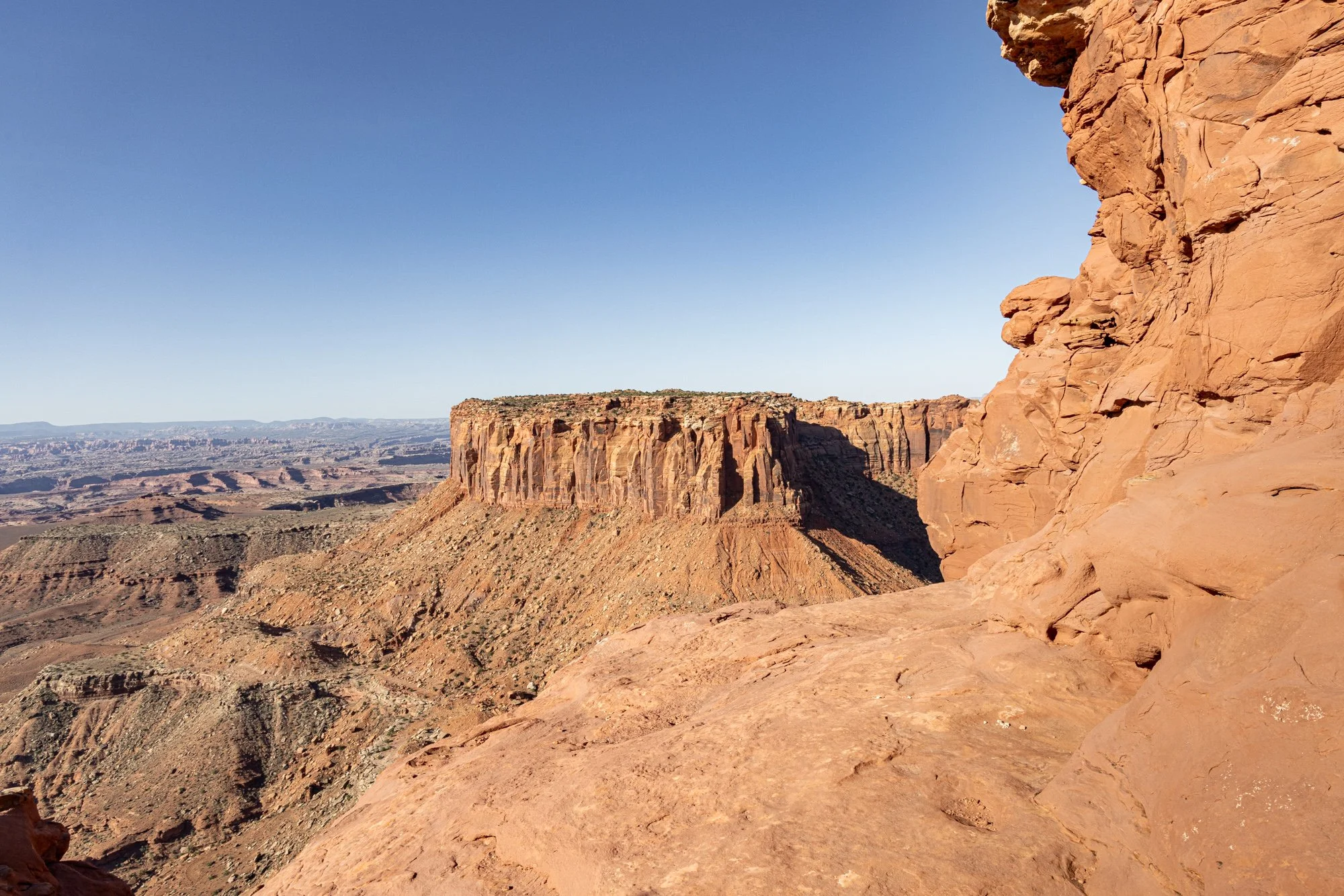
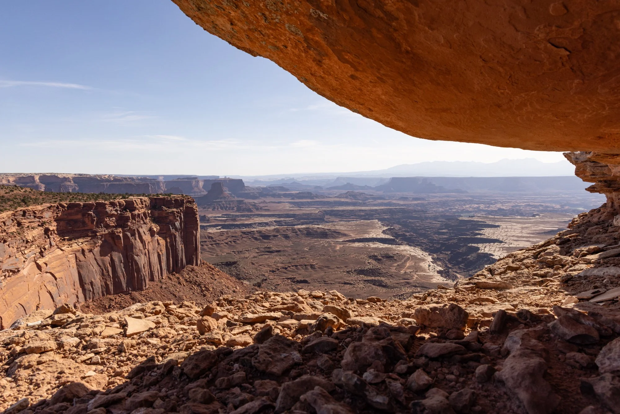
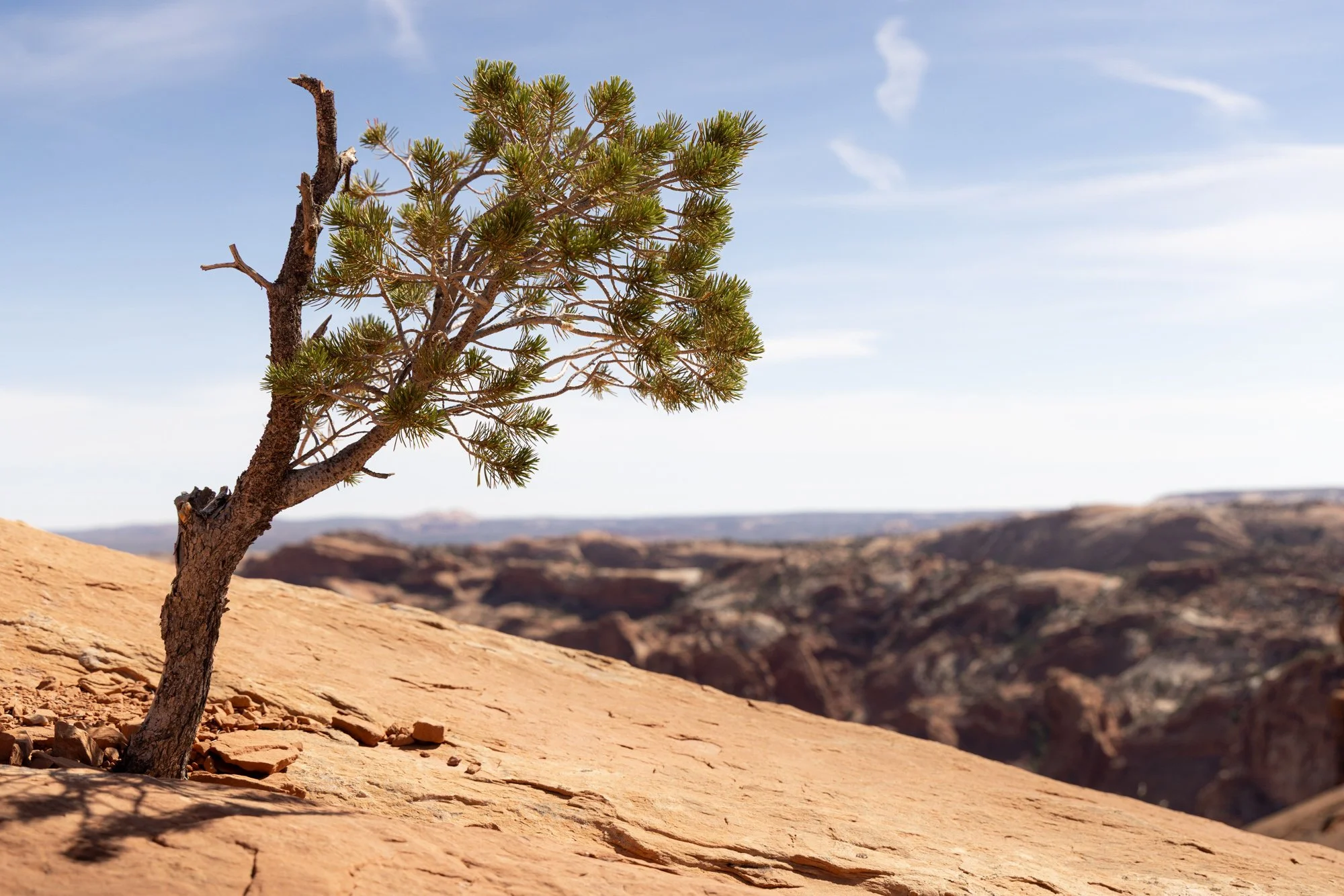
Located in the Island in the Sky district of Canyonlands National Park, the Mesa Arch is a stunning natural feature with breathtaking views of the canyons below. When early morning light bounces off the rock, it creates an orange glow beneath the arch, and this detail (well, and the view, of course) is why the “Mesa Arch sunrise photo” is such a thing. Boy, is it ever a thing.
The first time I recall seeing the arch was at my friend Drew’s place, on the wall above his couch. It was a large print of the arch at sunrise, about three feet by four feet, and it was…awesome, in the literal sense of the word. When it clicked on my recent trip trough the southwest that I’d be hiking in the park and have the opportunity to see the arch for myself, I thought maybe I should attempt a photo of my own.
I said just a moment ago that the sunrise photo is a thing. I suspected this, so I researched a little online about getting the shot, and in so doing I got a sense of just how much of a thing it actually is. It was clear I was in for it when I read that would-be photographers should plan to reach the arch an hour before sunrise to claim a spot.
I stayed in Moab the night before, and it would take me an hour just to get to the arch from my hotel. With sunrise at about 6a at the end of May, I set an alarm for 3:50. My bags were ready to go. The arch is only a .3 mile hike stroll from the road, which on the one hand is great because it’s easy and you don’t have to go far in the dark, but on the other hand is really bad because it’s sooooo accessible. I wonder how many fewer people it would attract if it were even just a mile off the road. Or two miles?
At 5a there was already one person there, camera on tripod. But another thing I’d read was that there are plenty of good spots to get a decent photo, so it’s not like there’s only one vantage point that works. I poked around for a moment and settled on a patch of sand about ten feet to his right. I liked my framing and in the end was actually thankful the other guy was there when I showed up—if he hadn’t been, I probably would’ve landed there myself and missed getting the sun in such a great spot. Things tend to work out.
What should you know if you want to do this yourself? Aside from the get-there-early tip (which is a really good one, by the way, because I was shoulder to shoulder with at least thirty other people by the time the sun came up), I can think of several. One, I wish I’d worn warmer clothes. It’s cold up there, especially with the battering wind. Two, I wished for goggles. Sort of kidding about that, but the wind is no joke. It does whip up a lot of stuff and I spent several very uncomfortable minutes desperate to get a grain of sand out of my eye. Three, know that you’ll need to stabilize your camera so you can bracket your exposures. The contrast in the scene is too much for a camera, and if you want good detail in your highlights and shadows, you’ll have to HDR it.
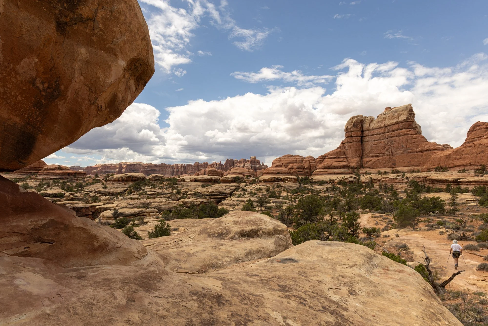
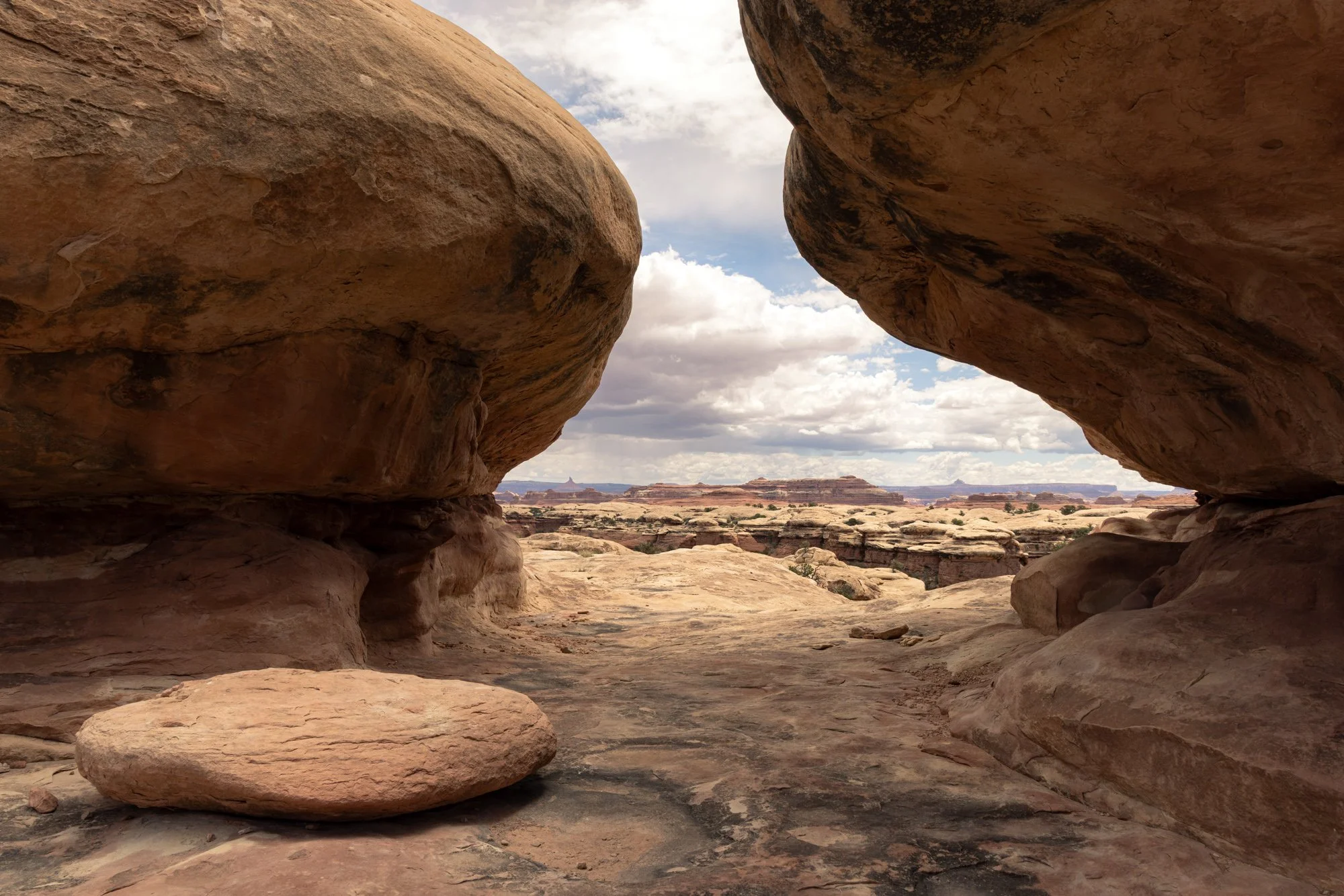
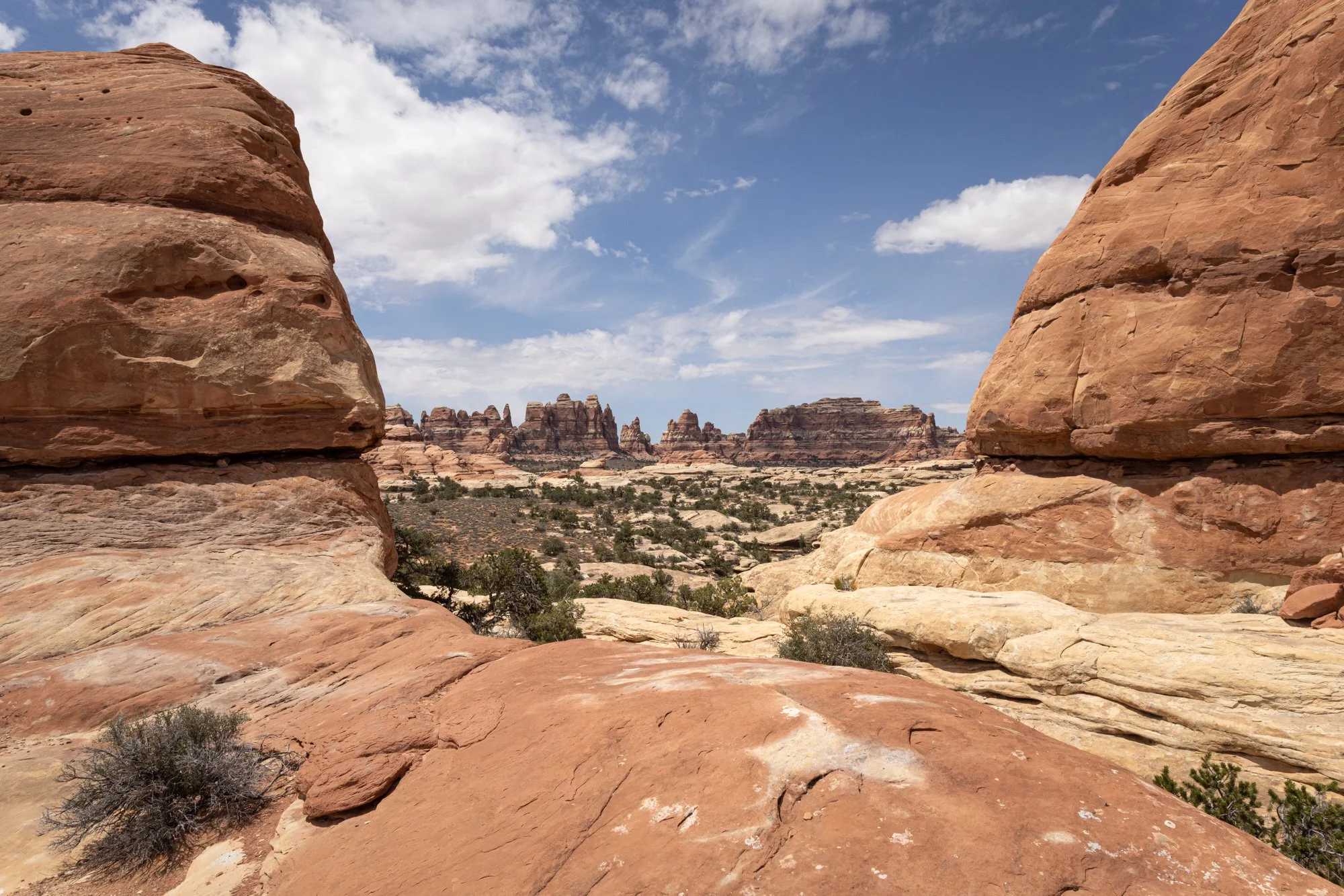
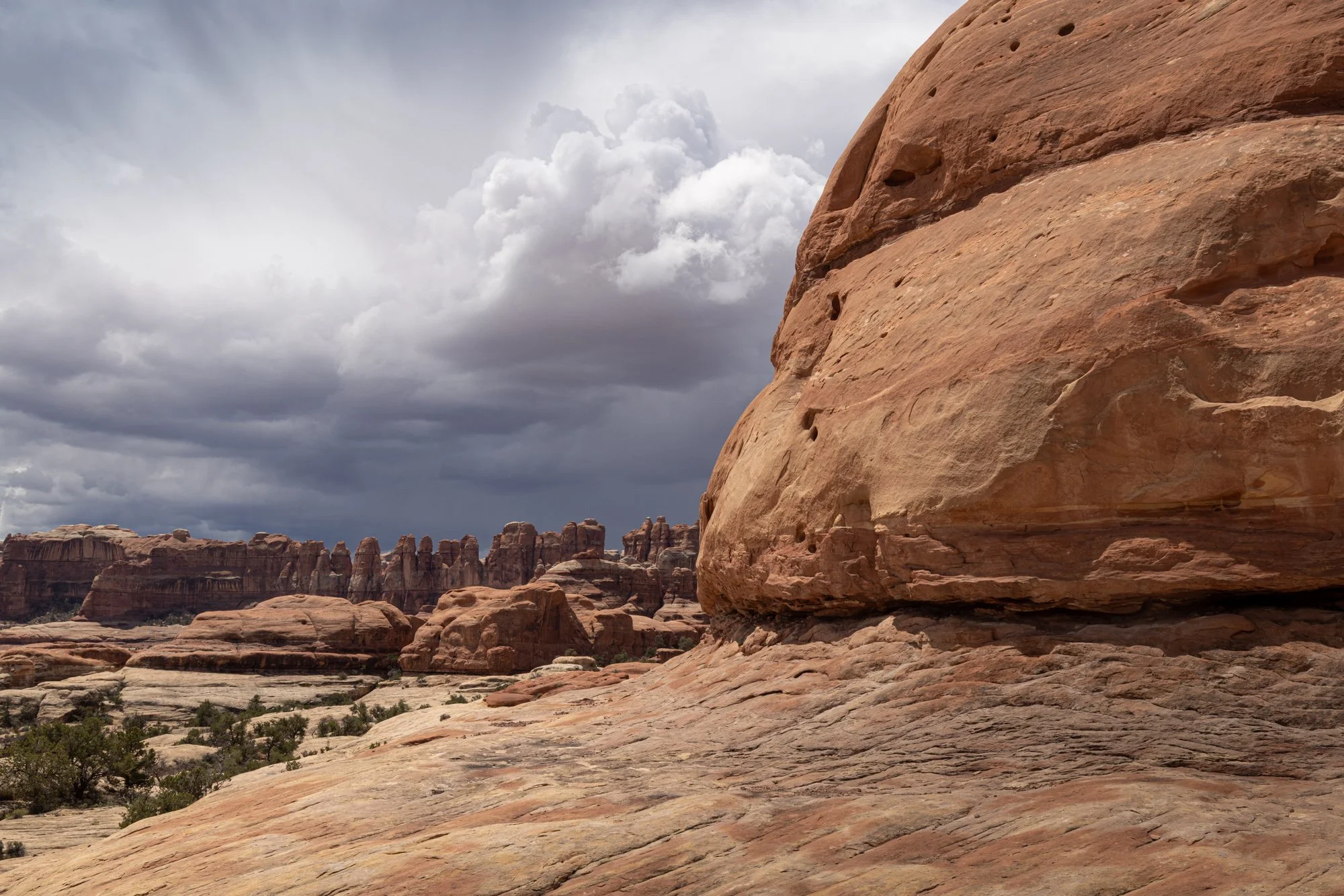
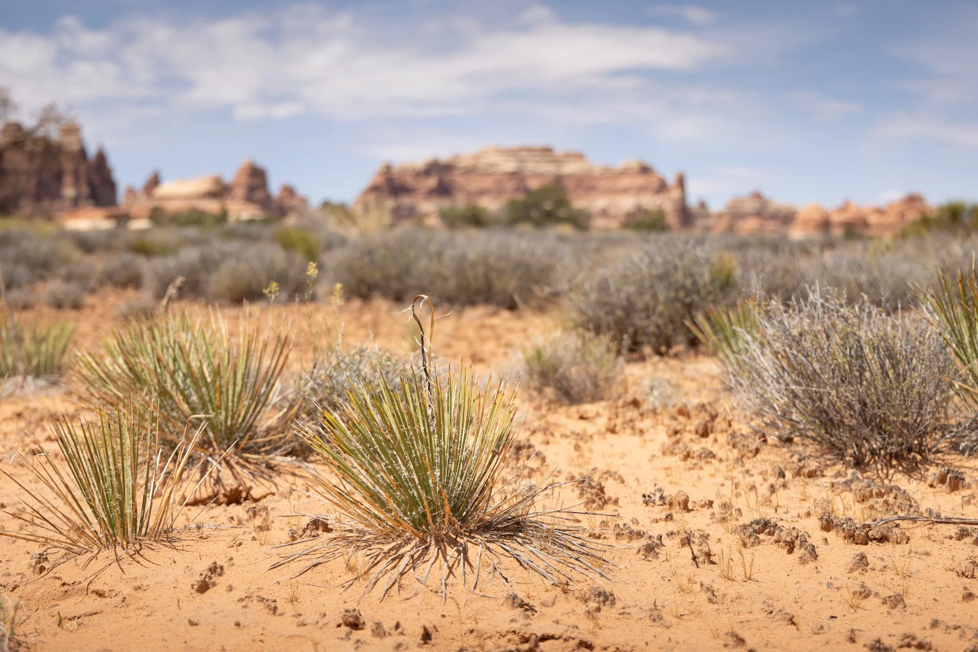
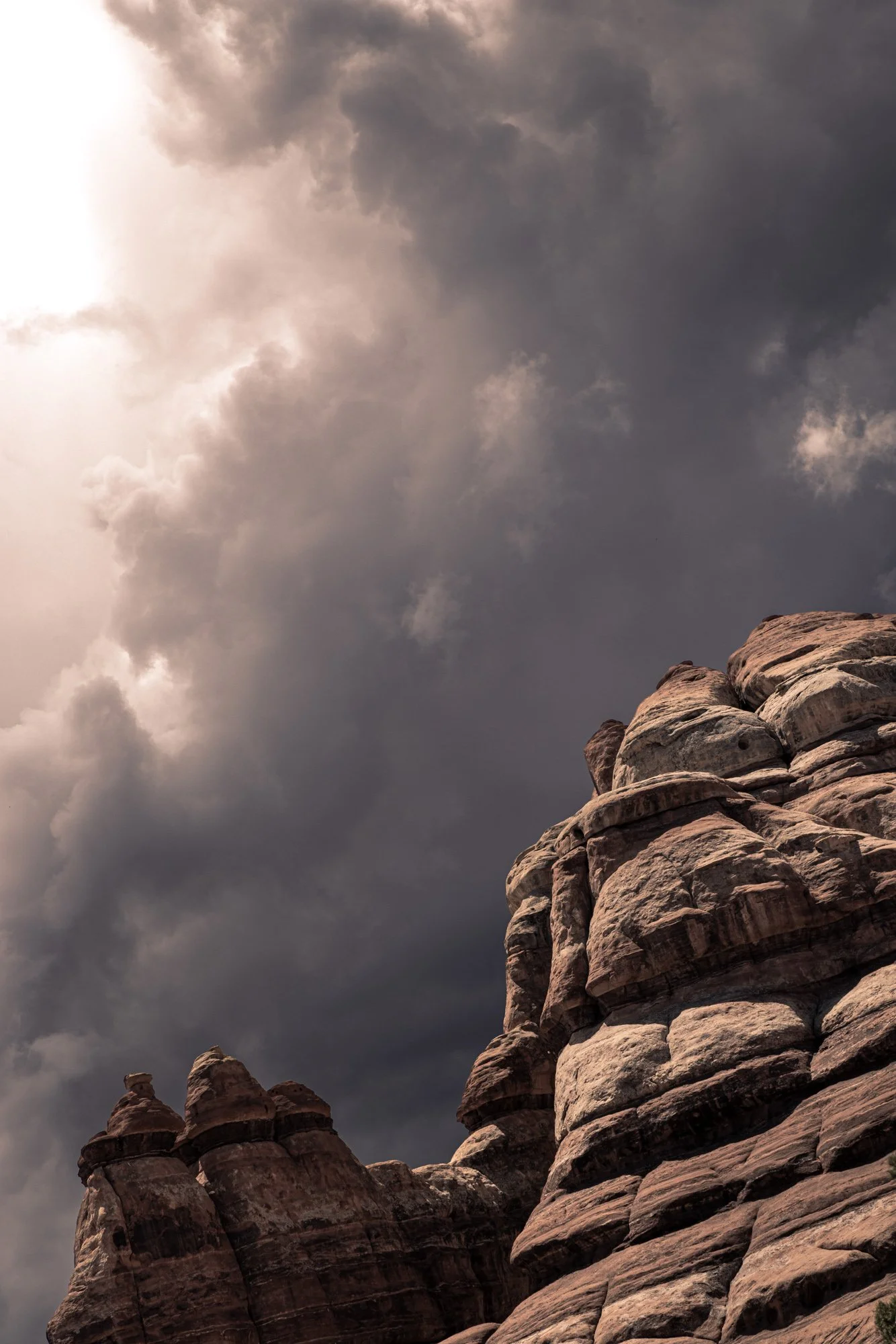
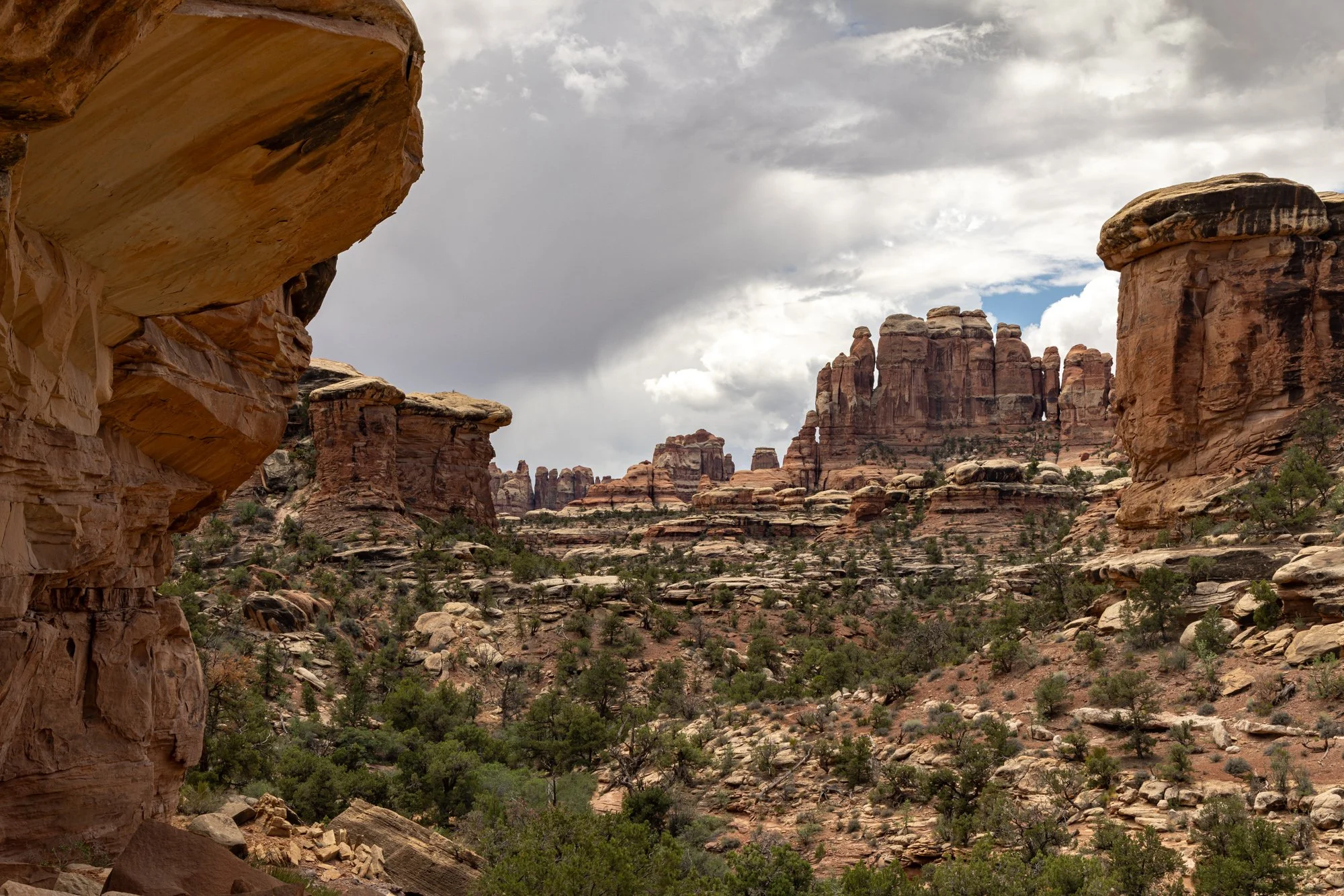
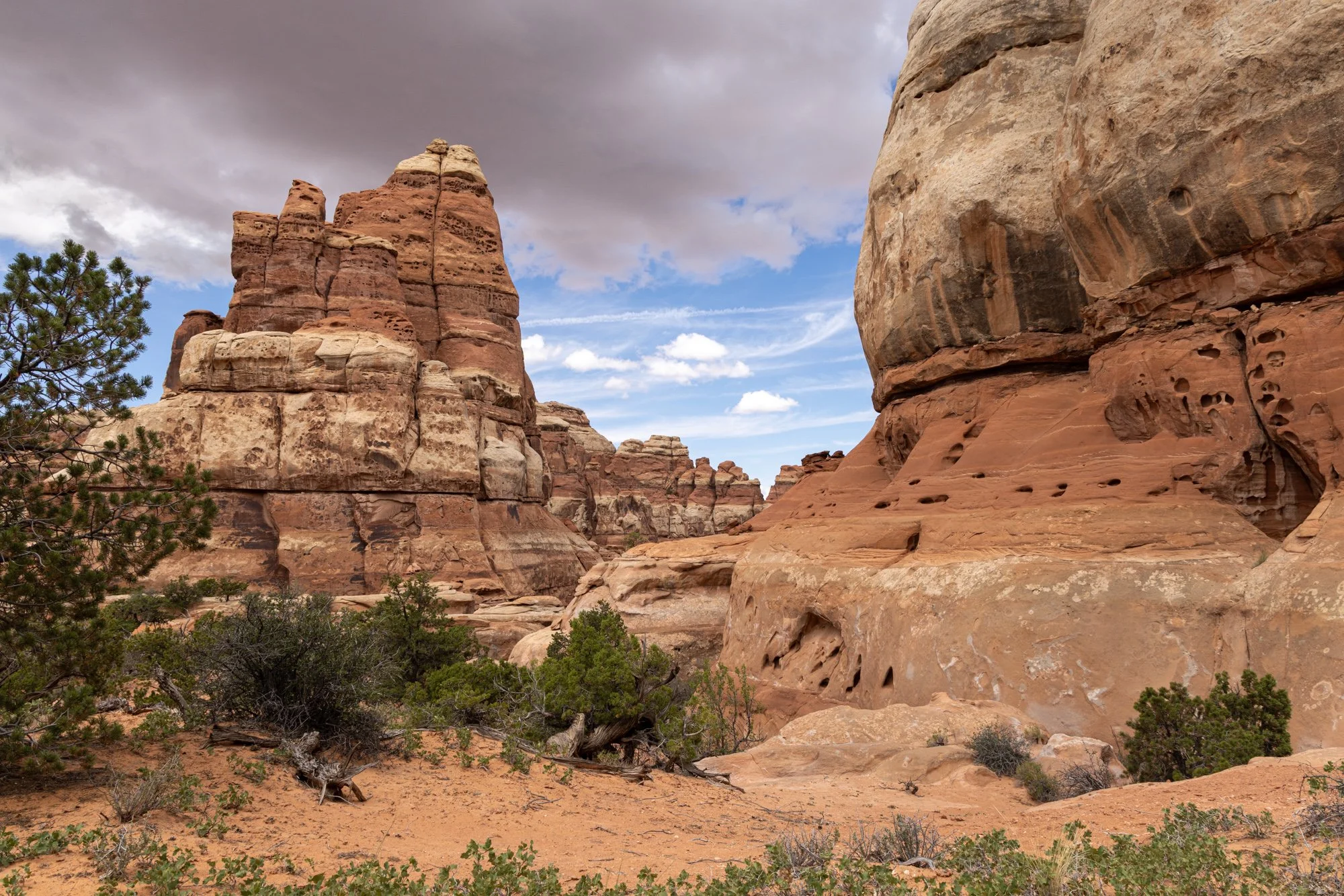
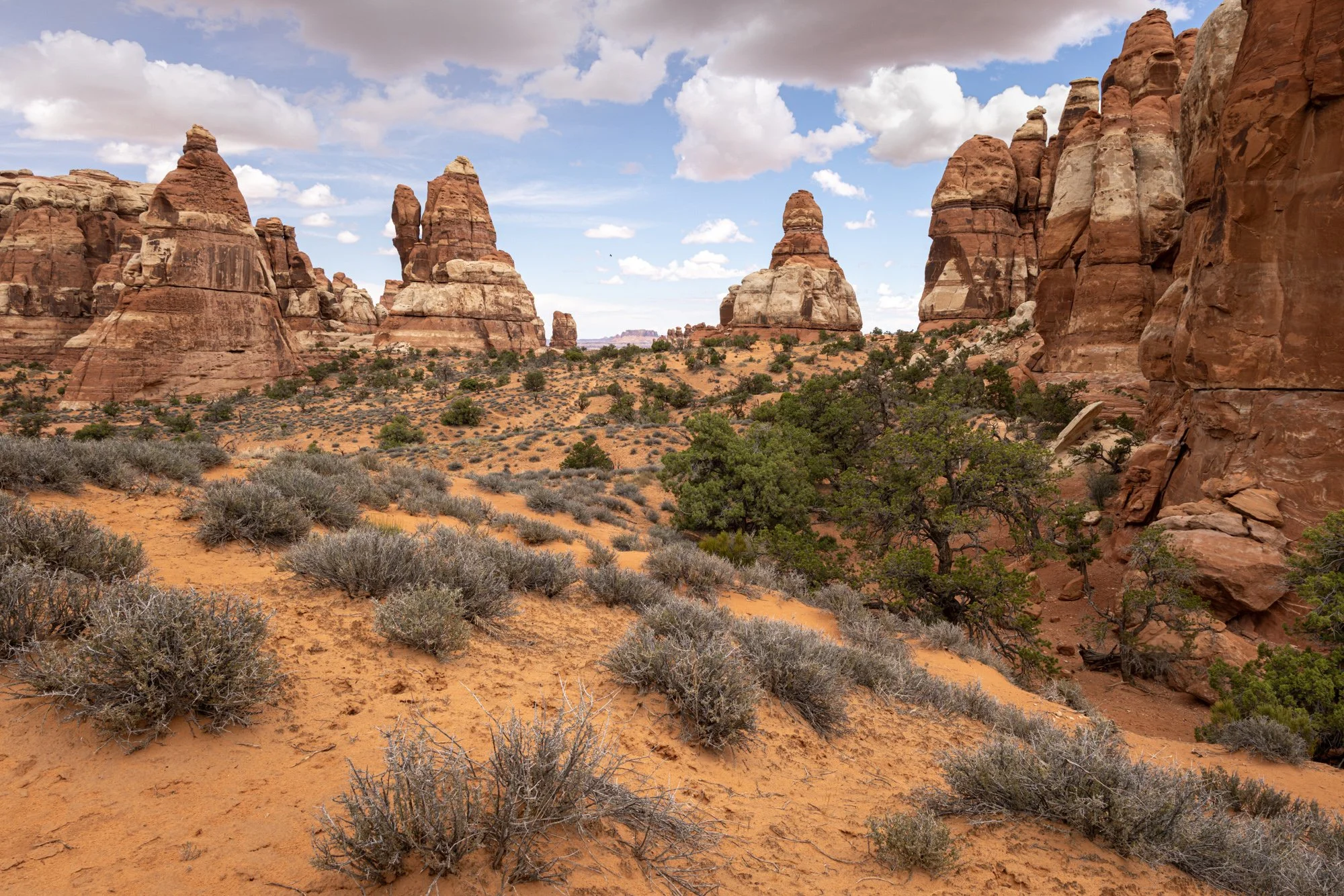
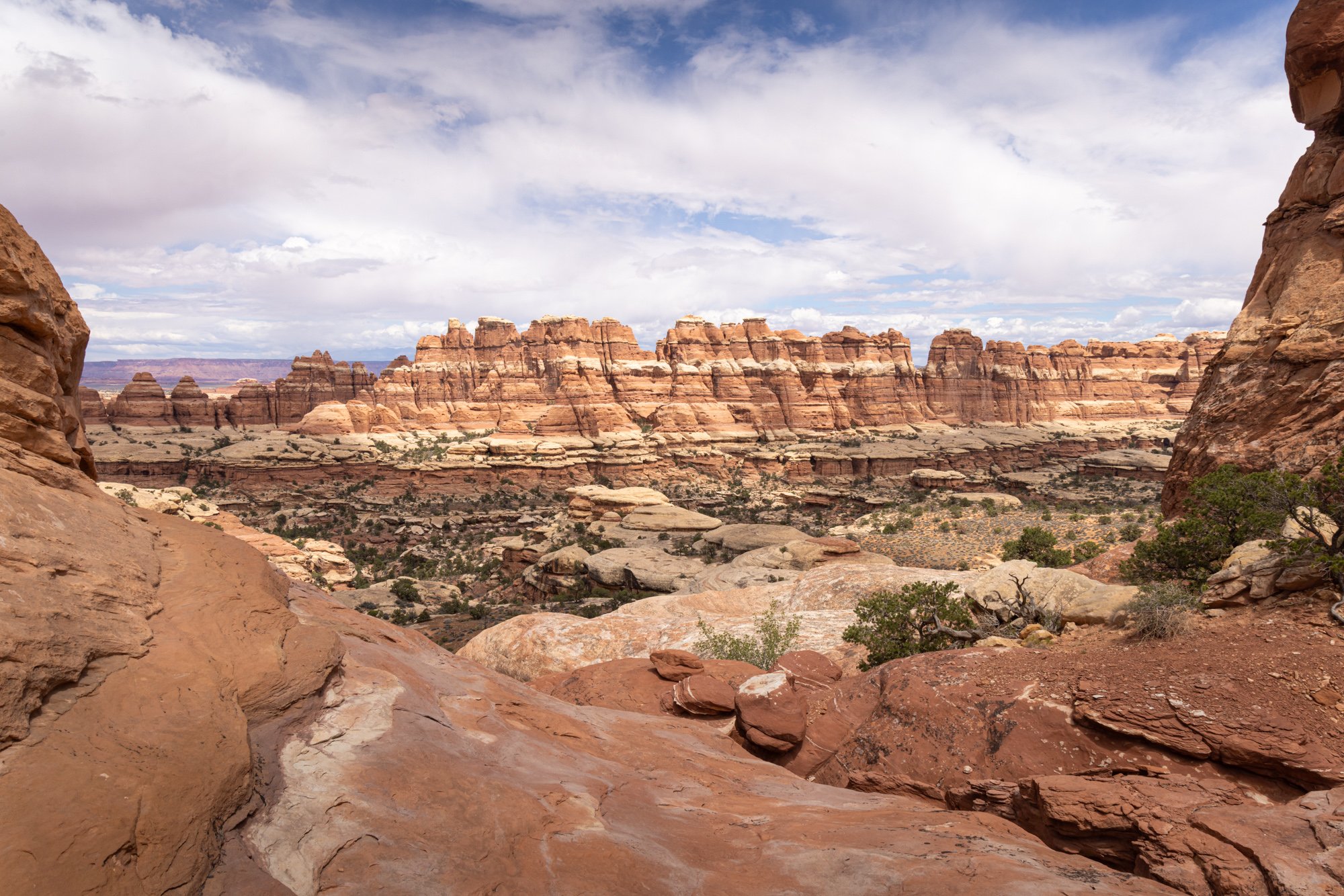
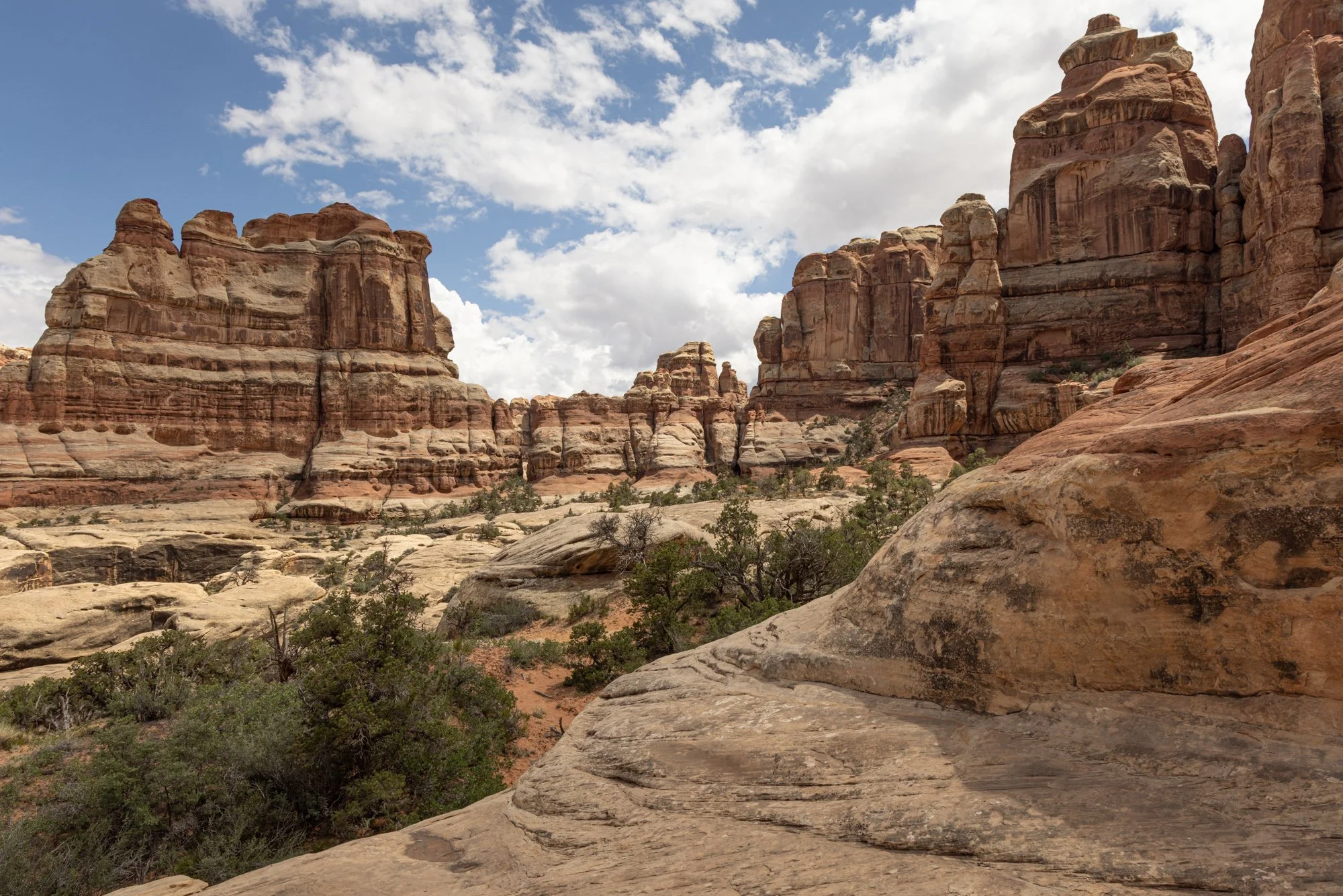
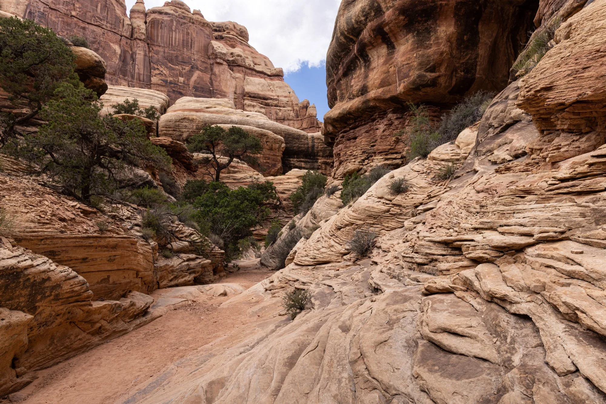
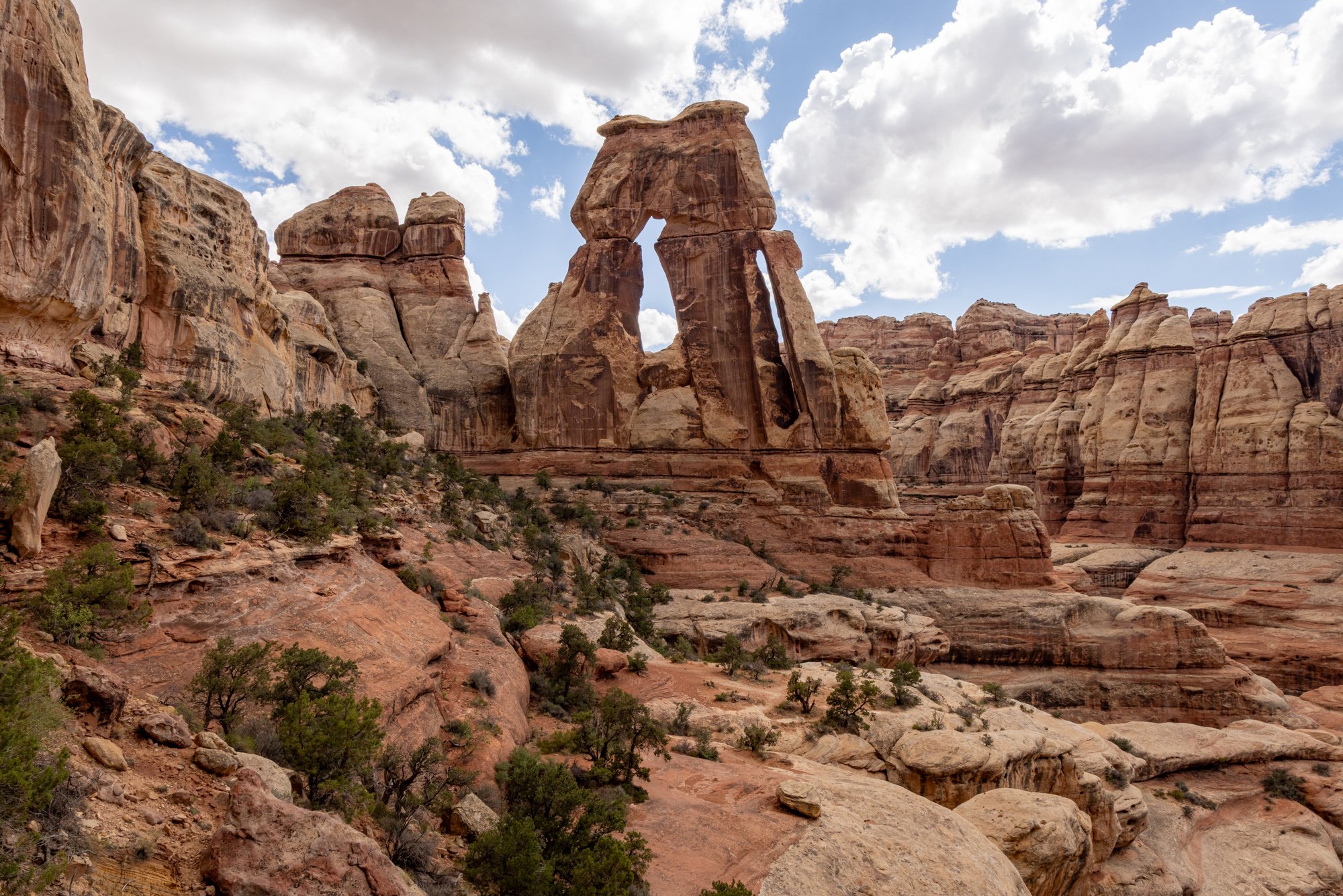
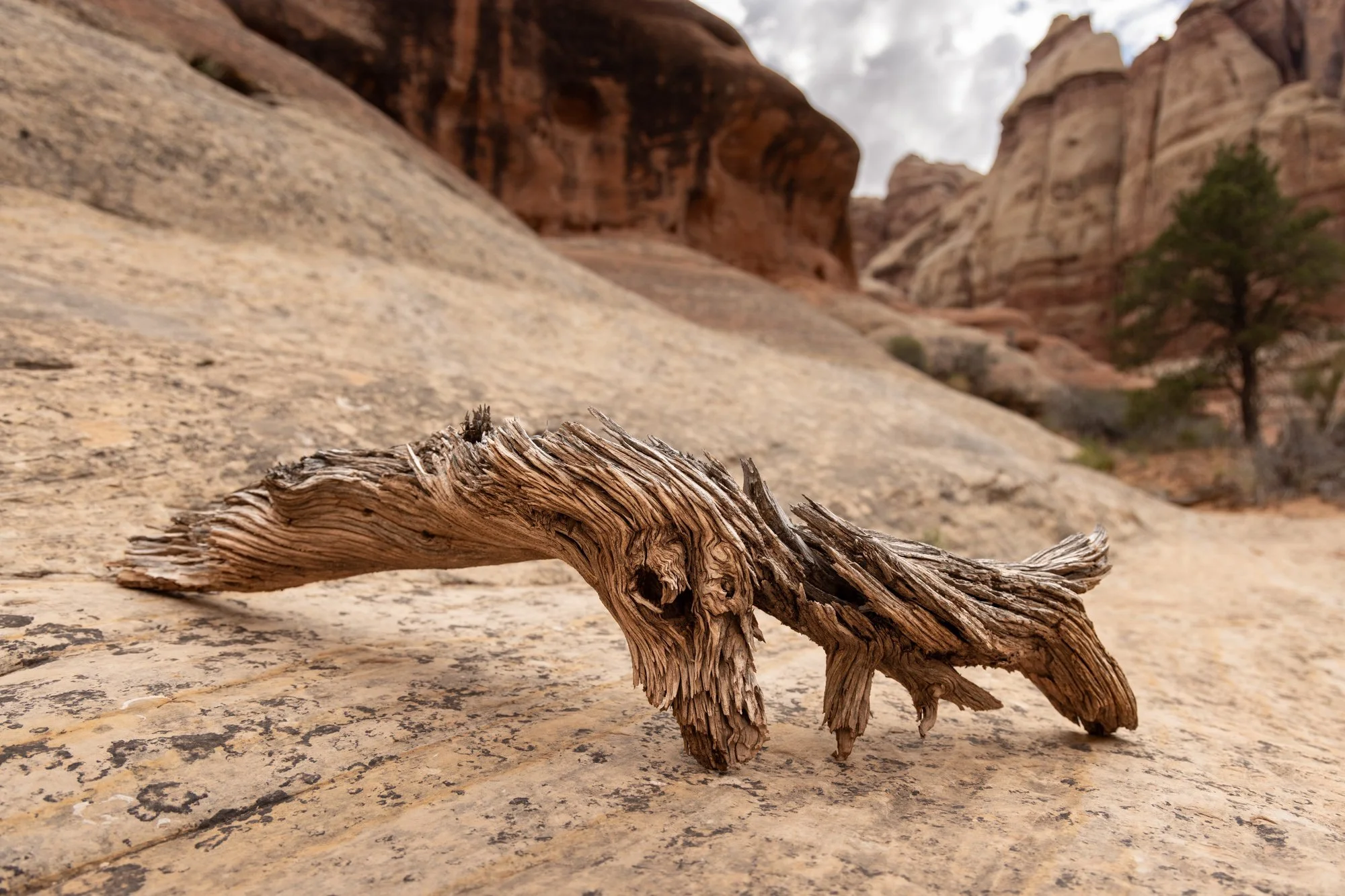
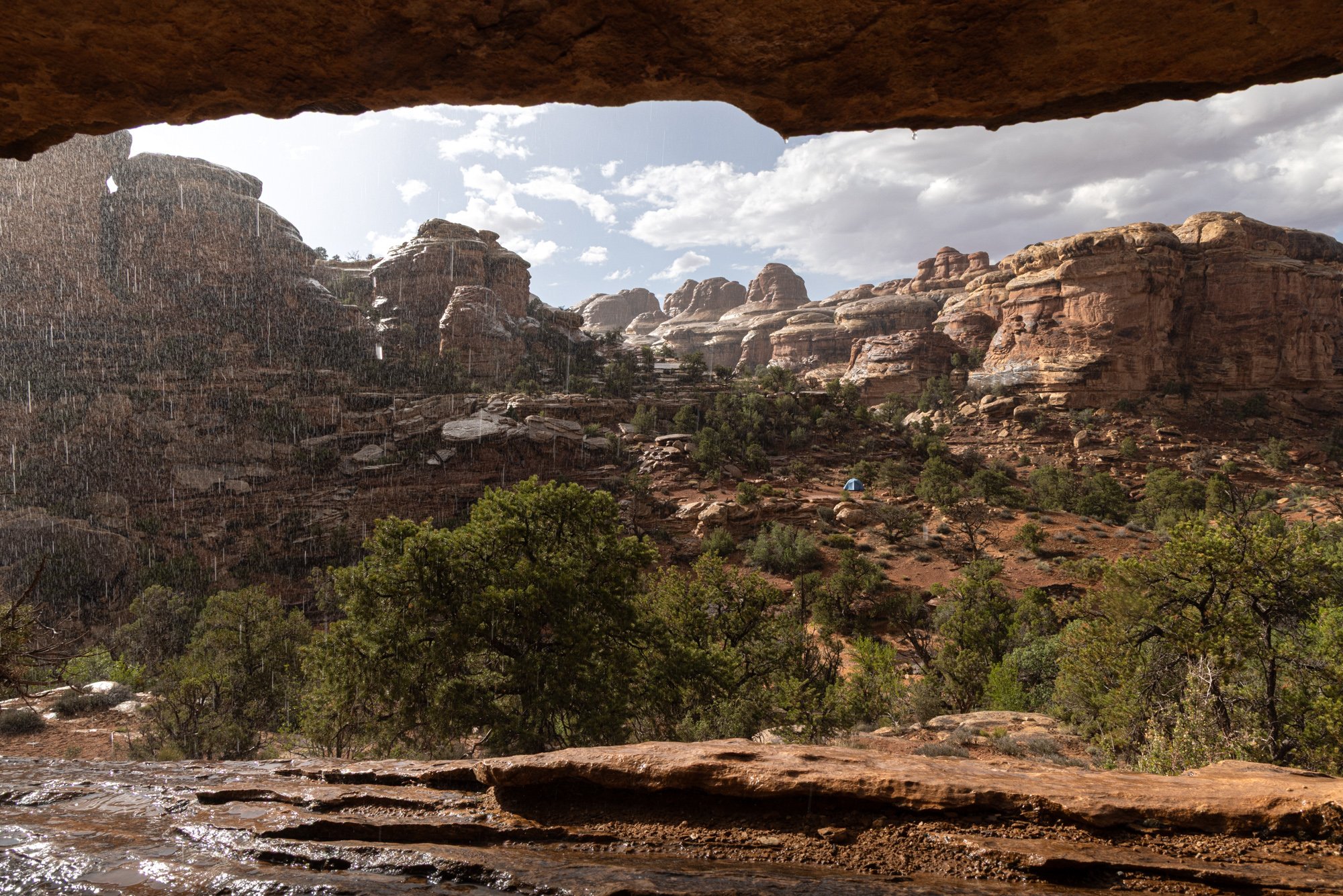
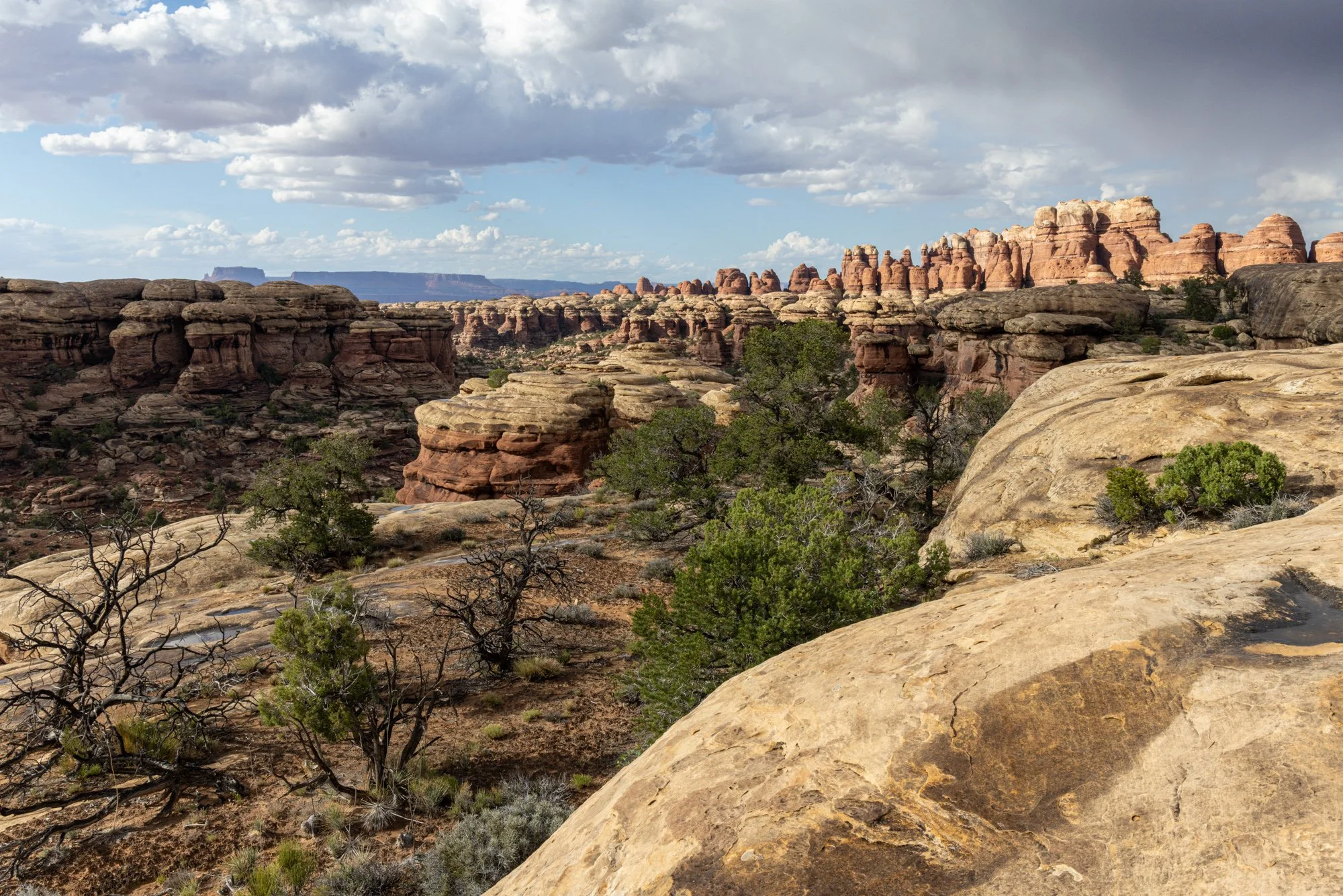
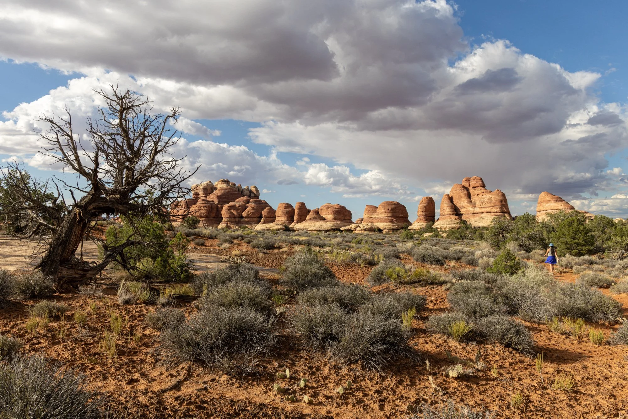
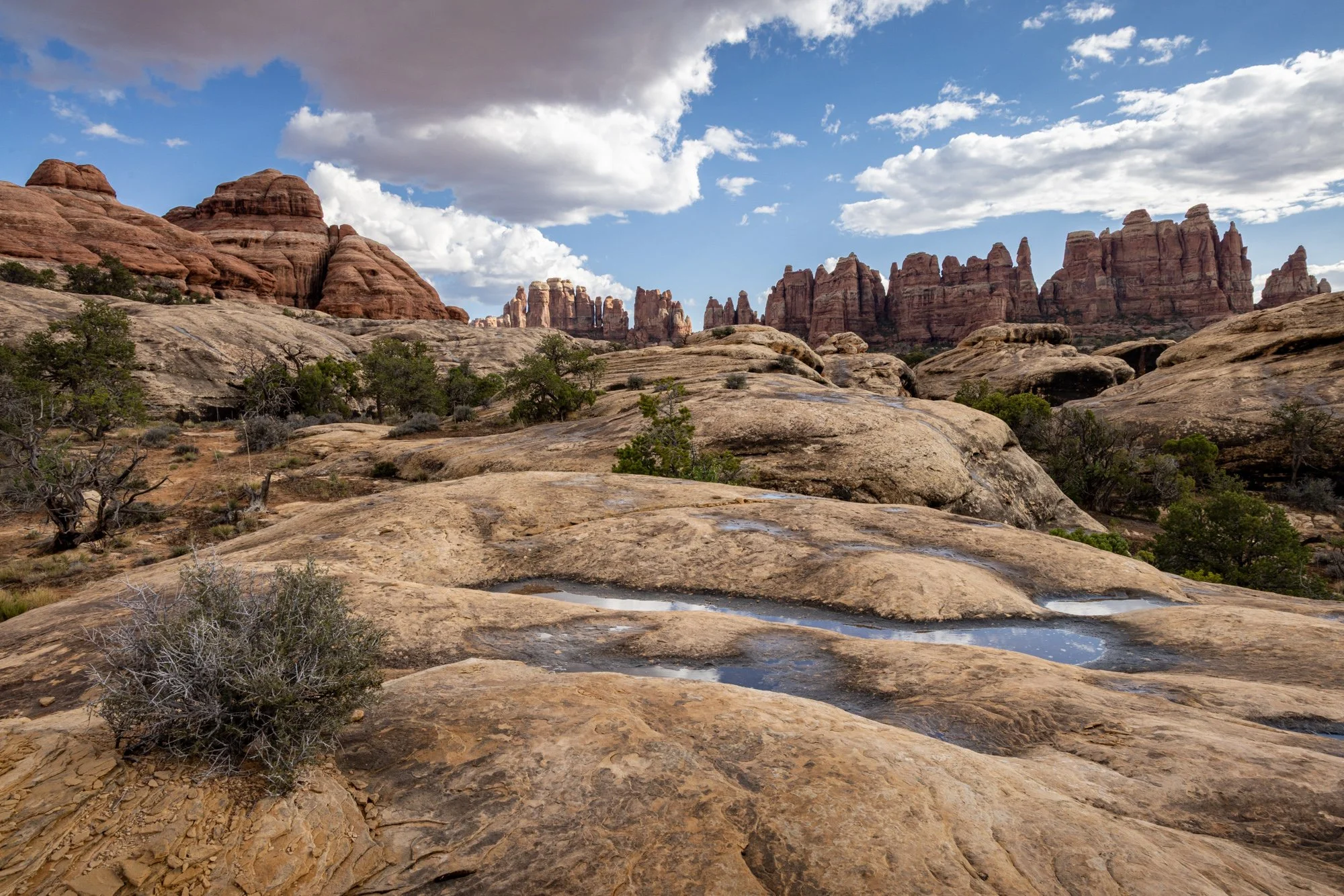
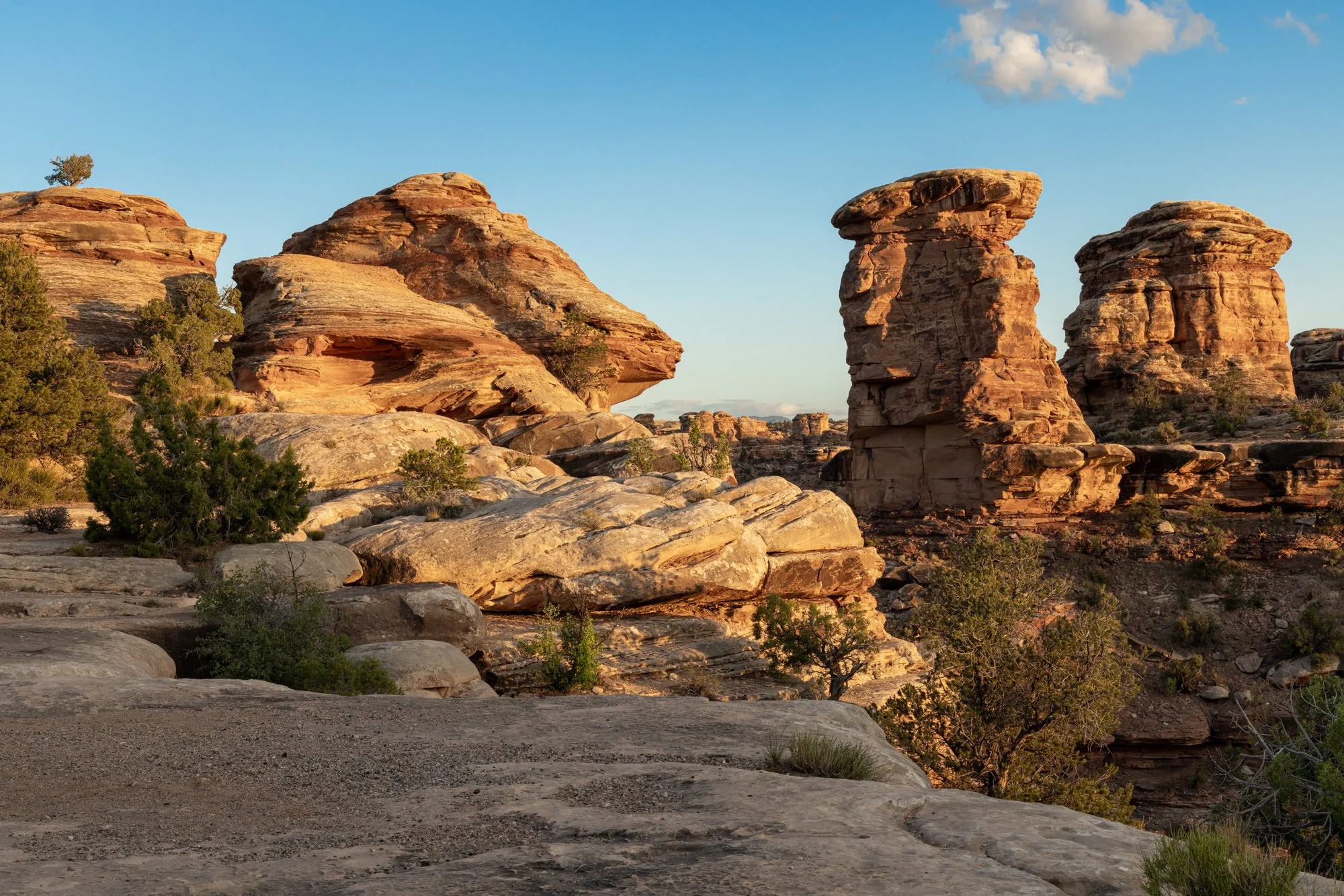
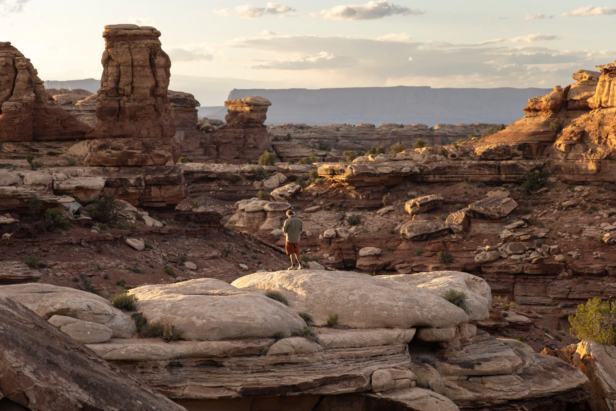
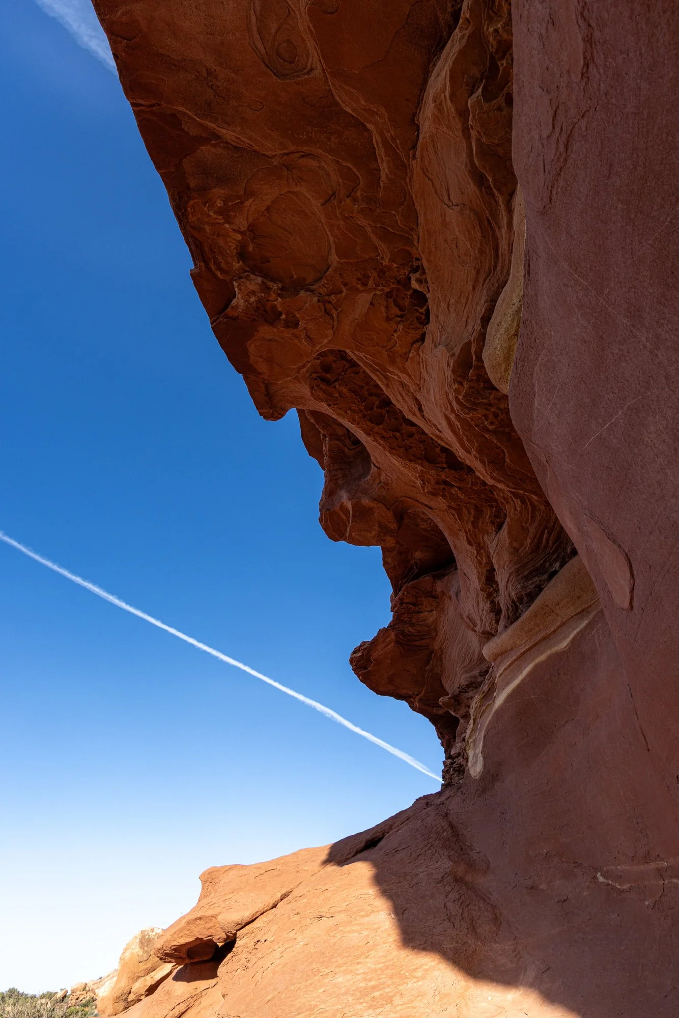
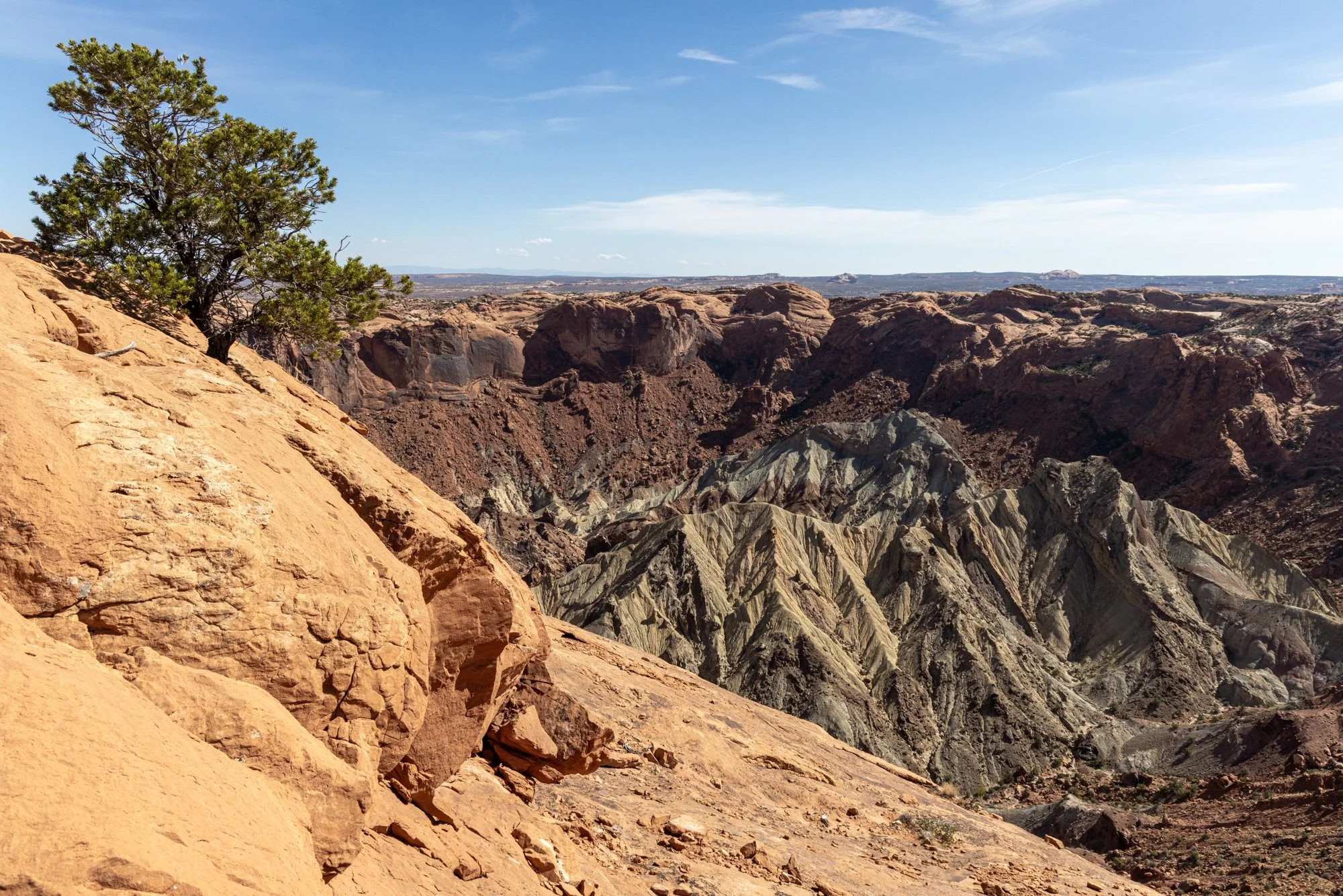
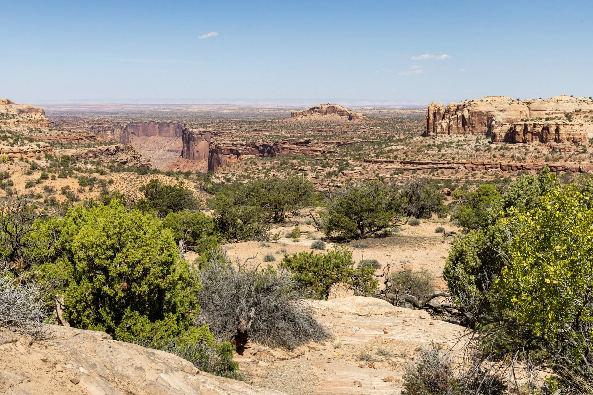
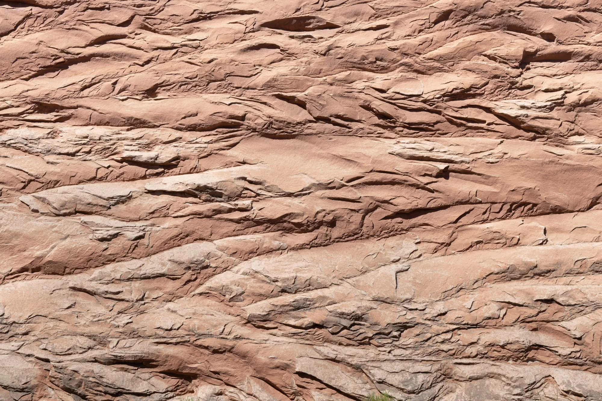
I doubt I’ll ever be back at the arch at sunrise, but I’m glad I got the shot. Canyonlands is an incredible place. Below are more photos, if you’d like to take a look. Most are from my eight or so hours hiking in the Needles district of the park (in the canyons), but there are a few here from Island in the Sky as well (above the canyons, looking down into them). Click to see them larger, and enjoy!